TERRA MATER WISSEN

The TV show “Terra Mater Wissent” deliveres knowledge straight to the point. Astrophysicist Dr. Gernot Grömer presents  insights into nature, technology, and society. He also shares trends and developments from science and research that are shaping our world.

The task was to develop a design that visually represents the diverse categories of topics discussed in the show. Each category is distinctly categorized, yet seamlessly connected through the overarching theme symbolized by the Terra Mater logo—the tree. This iconic element serves as a unifying metaphor for connection, growth, and knowledge.

MAKING OF

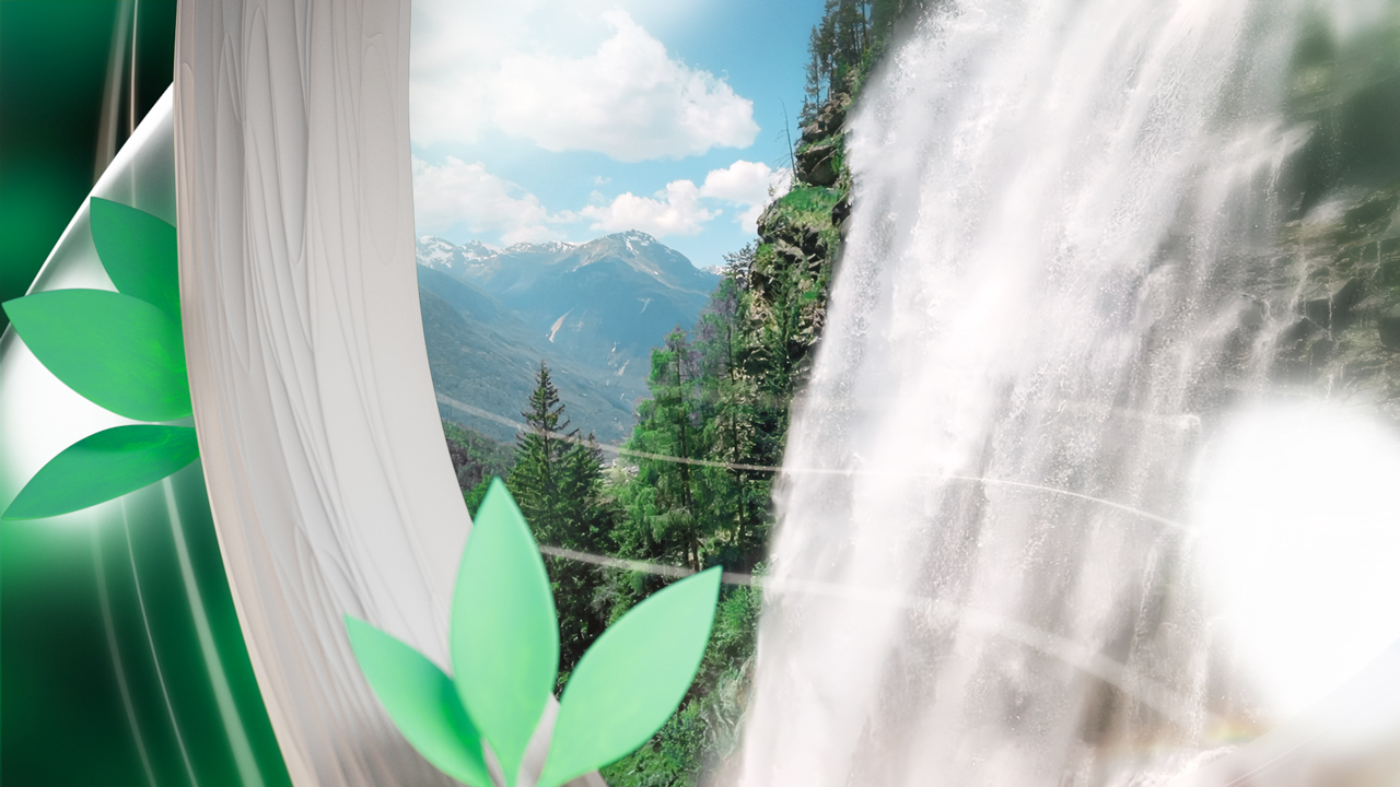
The motion design concept uses an abstract representation of a tree (the show’s logo) as its central symbol, embodying the ideas of networking, growth, and connection. The tree is depicted organically but in a reduced form, with detailed shots of branches, foliage, and intricate structures. These are enhanced by high depth-of-field effects and atmospheric backlighting, creating an immersive visual experience. The colors of the foliage play a crucial role: each category is highlighted by a specific color scheme (red = humanity, green = nature, blue = science), while the branches and trunk remain white to act as a neutral, connecting element between the themes.

The concept focuses on striking key moments that represent each category, with dynamic camera movements seamlessly linking the scenes. Zoom-ins along a branch, gentle rotations around a leaf structure, or gliding through the tree’s canopy create smooth transitions between themes, reinforcing the impression of growth and movement.

The final camera movement transitions from close-up details to a wide shot, revealing the tree (the logo) as a whole, embedded within an abstracted biosphere. This is surrounded by luminous color gradients that reflect the foliage’s vibrant palette and is illuminated by atmospheric backlighting. The tree is symbolically integrated as a logo that encapsulates the connection between categories and the brand’s vision.

The show is produced in two different studio settings, each with its unique screen placements. The design challenge was to create a cohesive and visually engaging environment that ties together the opener sequence, studio design, and infographics. The result is a uniform visual language that enhances the storytelling while providing a clear and structured framework for categorizing the wide range of topics.

LOGO DRAFTS

The redesign of the Terra Mater Wissen logo retains its original qualities and recognizability, ensuring the essence of the brand remains intact. The form has been thoughtfully simplified to enhance performance in digital broadcast environments, ensuring clarity and detail are preserved even at smaller scales.

Additionally, the watermark now features the initials “TM” enhancing scalability and creating a subtle connection to the former TV show “PM Wissen”, bridging familiarity for the audience while reinforcing the brand’s identity.

STYLEFRAMES

The initial styleframes and proof of concept were created to establish the visual foundation for the project. While the base idea and overall concept remain consistent, with the central themes and symbolic elements intact, the specific subjects have been adapted to better fit the evolving needs of the design and tv show.

The original color system, however, has been preserved to maintain visual coherence and reinforce the conceptual framework. These adjustments ensure the design remains true to its initial vision while allowing flexibility for refinement and adaptation.

STUDIO - MOCK UPS

For the design of Studio 1, diverse visualizations and mockups were created to showcase its unique setup featuring 12 screens, each strategically placed to form a harmonious and visually captivating environment. The goal was to craft an aesthetically pleasing space that maintains a continuous visual connection across the screens, creating a unified atmosphere. Central to this design is the geosphere, symbolizing the core environment of the show. It is surrounded by abstract bokeh elements, representing gently moving leaves, and augmented with particle trails to introduce additional movement and dynamism.

This visual approach ensures the environment feels dynamic and engaging without drawing focus away from the content being presented or the show’s moderator. To emphasize the show’s thematic versatility, three distinct color schemes were developed: red to signify humans, green for nature, and blue for science. These colors help to contextualize and amplify the topic currently under discussion, adding clarity and depth to the visuals.

INFO GRAPHICS

At the heart of the show is the geosphere, featuring the Terra Mater Wissen logo as its central, unifying element. This sphere symbolizes the three distinct categories of the show, while highlighting their trans-topic connections and the fluid, transformative nature of knowledge.

The studio and geosphere design offer a broad range of possibilities for transitioning fluidly between the geosphere and the featured content. The looping color transformations of the geosphere ensure continuity, creating a harmonious flow that enhances the storytelling while visually connecting the content back to the central theme of the show.

Within the studio design and infographics, the geosphere functions as a dynamic, transformative element. Depending on the topic, it adapts to display various content, such as images, videos, and data visualizations. To support this versatility, a series of transitions were developed, allowing the abstract background elements to seamlessly integrate and present content while maintaining visual coherence.

STUDIO

Some screen captures (© ServusTV) that highlight its charismatic moderator, Dr. Gernot Grömer, as he brings engaging insights to life. Each capture showcases the dynamic studio environment, with its color schemes adapting seamlessly to the chosen category of the currently discussed topic.

Whether the topic revolves around nature, technology, or society, the studio’s color settings shift to reflect the corresponding theme—green for nature, blue for science, and red for humanity. These subtle yet effective transitions create a visually engaging atmosphere, reinforcing the thematic focus while maintaining a cohesive and polished aesthetic throughout the show.

CREDITS

  • CLIENT
    ServusTV
  • ROLE
    Art Direction, Design, 3D / 2D Animation, Studio Design
  • PROJECT MANAGER
    Allegra Hell
  • ART DIRECTION
    Doris Schuster
  • INFO GFX
    Martin Müller
  • MUSIK / SOUND FX
    “Skyline” Composer: Tuomas Pitkaenen & Mika Hamed (P) Sounds of Redbull

^